Vaporstream
UX / UI / Research
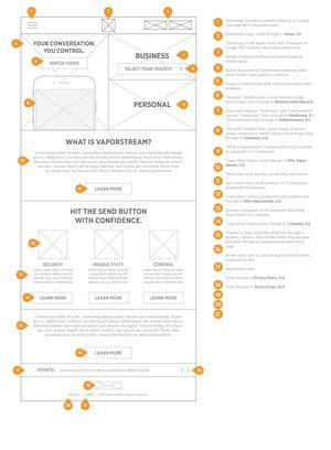
Vaporstream is a mobile, tablet and desktop application that uses ephemeral messaging to send messages while ensuring privacy. Compared to its competitors, Vaporstream has the most advanced technology but was losing potential clients based on its outdated and confusing website.
Problem
The previous marketing website was severely flawed:
No clear route that the user is pushed to take.
Antiquated look and feel; not professional.
Confusing layout with too much information being presented at once.
Doesn’t effectively explain how it works.
“I just want to know exactly why Vaporstream is better than its competitors.”
— User testing quote
Role & stakeholders
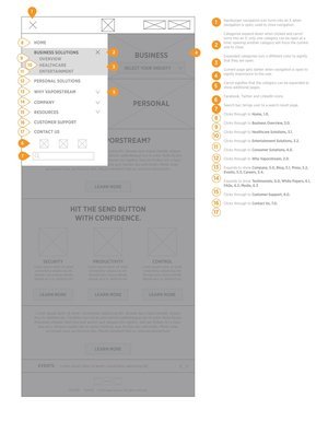
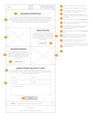
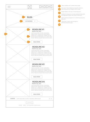
As the sole UX designer on this project, I was tasked with conducting user research, creating personas, creating the structure of the site, creating wireframes and high fidelity designs.
I worked alongside a product manager, business analysts, and front end developers.
Process
Throughout the project, I conducted a lot of user research and netted out on 4 different persona types: CIO Buyer for Healthcare, IT Director for Healthcare, CIO buyer for Entertainment and CMO Buyer for Healthcare. Priorities were:
Keeping things running reliably and securely, while making sure technology and applications align with business priorities
Trying to modernize and transform core systems and infrastructure to deliver added value, enhance business performance and increase security


